Kings Logo PNG
 Sacramento Kings Logo PNG
The US basketball team Sacramento Kings has gone through several brand identity overhauls, including new names and logotypes. And yet, the logos have been rather consistent in some of the design elements (for instance, the shield shape and the half basketball).
Meaning and history
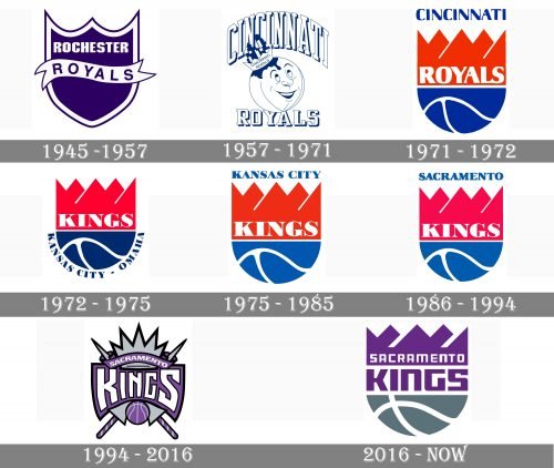
The visual identity history of the Sacramento Kings basketball club is linked to numerous relocations of the team throughout the years. It was established as Rochester Royals, then moved to Cincinnati, 1972 the club started to play in Kansas, and, finally, in 1985 the Sacramento Kings appeared, and this is when the modern era of the logo designs starts.
1945 — 1957
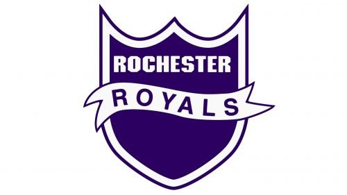
The very first logo for the club depicted a modest traditional crest drawn in blue and white with a smooth white ribbon placed horizontally in the middle of the badge. The blue "Royals" lettering was placed on the ribbon, while the "Rochester" was written above it, on a blue background.
1957 — 1971
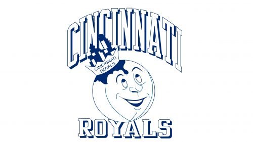
With the new Cincinnati Royals name, the new logo was introduced in 1957. It was a caricature of a basketball in a crown with a narrowed arched "Cincinnati" inscription above it and straight "Royals" under the image. The whole logo was executed in white and outlined in blue, looking fresh and modern.
1971 — 1972
The redesign of 1971 brought another shield to the Royals' visual identity. This time it was a modern rounded structure in red, blue, and white, with the "Royals" inscription executed in extra-bold smooth Sans-serif and placed in a red background color and "Cincinnati" in blue capitals set above the crest.
1972 — 1975
After another relocation, the club gets a new name in 1972, and now it is Kansas City — Omaha Kings. The visual identity is based on the previous version, but with the "Kings" inscription replacing the "Royals" and the location mark arched under the crest, in blue serif capitals.
1975 — 1985
The logo for Kansas City Kings was repeating the previous version but had its color palette a bit lightened up, and the "Kansas City" was placed in a straight line above the crest. The lines of the logo were cleaned and refined and the new emblem looked confident and delightful.
1986 — 1994
With the relocation of the club to Sacramento, the new logo was created in 1985. It was the same design as in 1975, but with a blue "Sacramento" wordmark replacing the "Kansas City" one, and the color palette made it a little darker and softer.
1994 — 2016
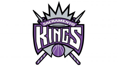
The redesign of 1994 brought a sharp and modern crest to the Sacramento Kings' visual identity. It was a purple and gray combination with the arched wordmark banner and a geometric crown with sharp peaks placed above it. The new lettering was written in white capitals of a square and strong Sans- serif typeface, looking modern and masculine.
2016 — Today
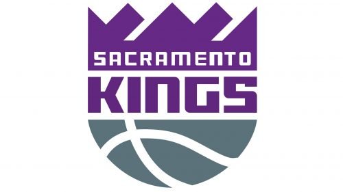
In 2016 the club decides to bring back its logo from 1986, but in a renewed color palette, purple, gray, and white. Now the purple "Kings" lettering is separating two parts of the crest from each other, and the "Sacramento" inscription is written above it, in white and placed on a purple background. The logo looks sleek and stylish, reflecting the progressiveness of the club and its professionalism.
Font

The typeface featured in the 2016 Sacramento Kings logo looks similar to the one used in the previous version in its style, yet it has been slightly modified.
Sacramento Kings Colors
PURPLE
PANTONE: PMS 268
CMYK: (81,100,12,2)
RGB: (91,43,130)
HEX: #5A2D81;
GRAY
PANTONE: PMS 431
CMYK: (15,0,0,65)
RGB: (99,113,122)
HEX: #63727A;
BLACK
PANTONE: PMS BLACK
CMYK: (30,0,0,100)
RGB: (6,25,34)
HEX: #000000;
Source: https://1000logos.net/sacramento-kings-logo/
0 komentar:
Posting Komentar